Unknown's avatar

About Mike Dickman

20-year marketing veteran doing my thing, one click at a time!

5 Link Building Lies You’ll Hear in 2016

By Travis Bliffen, Stellar SEO and first published on WebsiteMagazine.com

As 2015 draws to a close I can all but hear content marketers dreaming up the click bait headlines that will run amuck in 2016.

Rolling over to a new year is a trigger point for “this or that is dead” articles; you would think that Google only makes update at the end of the year the way articles start popping up. That being said, here are five link building tactics that will still work in 2016 unless Google does decide to actually make a yearend change, in which case, we will cover it here, so sign up for Website Magazine’s Mastering Search emails if you haven’t already.

1. GUEST POSTING IS FINALLY DEAD

Low-quality guest posting for the sake of building keyword rich anchor texts has been a bad idea for a few years now, if you are still doing this, it is time to get up to speed. If you are reaching out to high-quality sites that market to your audience, guest posting is never going to die. Even if it didn’t boost your rankings, it would still send qualified referral traffic, an instant win. So next time you read about the imminent death of guest posts in a headline, save your time and read something useful like how to build high quality links without writing a ton of content or tips on how to create great content.

2. WEB 2.0 LINK BUILDING NO LONGER WORKS

In the past many link builders would start link building campaigns off by creating blogs on sites like WordPress, Blogger and Rebel Mouse. In the past, a single article, often times spun, would be added to the blog and linked to the money site. These blogs would then have high volumes of low-quality links built to them in order to boost the Page Authority hosting the link. This method is no longer a good idea, as a matter of fact it should have ended in 2013 at latest.

That being said, you can still derive value from building out Web 2.0 sites. They can be a good source of traffic, can help you control your online brand reputation, and they can still be part of a good link building strategy. In order for them to have value though, you need to spend the time to create blogs that actually offer value to the reader. Every site should be set up as a standalone blog that people would want to read. Quality content, regular updates and ongoing link building to these blogs are a must if you go this route in 2016. Here is a great example of Tumblr, a Web 2.0 site being used by a brand properly.

If you don’t have the time or resources to manage Web 2.0s properly, focus on outreach link building instead.

3. PBNS ARE ALL YOU NEED

Done correctly, private blog network (PBN) link building can be pretty low risk and incredibly powerful. These types of links are like dynamite though. If you aren’t experienced, using them is dangerous. Failing to use them in just the right quantity can be disastrous and they are not always the best solution. If you are not familiar with building PBNs, don’t risk it, there are too many things that can go wrong. If you are using them, don’t make the mistake of using only these types of links. Link diversity is very important and you should be diversifying your efforts by getting links that drive traffic as well. Don’t try to cut corners and use just one type of links in 2016 or you are going to get burned. If you aren’t sure how to diversify, check out our recent post on creating your first 44 backlinks.

4. SEO SOFTWARE IS “ONLY FOR SPAMMERS” OR IS A “PUSH BUTTON LINK BUILDING SOLUTION”

There are tons of pieces of SEO software on the market today that range from automated link building tools like GSA Search Engine Ranker to tools like Scrapebox, often referred to as the Swiss Army Knife of link builders. Automated link building is not a good idea in 2016 unless you know exactly what you are doing, why you are doing it, and fully understand the risks of your methods. Other pieces of software are also wrongly demonized by those who don’t quite understand the many legitimate uses for those tools. Take Scrapebox for example, it was originally made to be a bulk comment spam tool and for that purpose, it is not useful to link builders any longer. On the other hand, you can use the tool to find broken links, locate resources pages at scale, and to pull URL lists from even huge sites, all of which are legitimate uses. Next time you read about a tool being the reason for an SEO failure, remember, no tool is better than its operator.

5. LINK BUILDING IS ALL YOU NEED

This may seem obvious to some of you but I have gotten numerous calls from people asking for our link building services and wanting to pass on any on-page SEO reviews or edits. As I touched on last week, SEO has evolved and with it, our role as marketers has also evolved. In order to successfully promote and rank a site, technical on-page SEO, page speed, UX, content assets and link building are all needed. If you want to get to and stay on top in 2016, you need to build assets that deserve to be ranked and that users will enjoy.

BONUS TIP: STOP ASKING – START RESEARCHING

I see and hear one type of question all the time. How many links do I need? What anchor text ratios should I use? How long does my content need to be? Etc. Etc. Etc.

The truth is, there is not a set number that you should shoot for across the board. If you are trying to rank for roofing services in St Louis, take the time to see what the top 10 sites are doing and make a side by side comparison of those metrics. You will quickly see that every keyword, niche and location takes a different combination to rank so stop asking for generalizations and spend that time doing research. My go-to tools for competitive research are SEMrush and Majestic Backlink Explorer, neither of which I am affiliated with.


14 Tools and Apps To Transform Your Twitter Engagement

By Brian Fanzo and first published on his Blog

Twitter, like all social media platforms, has changed drastically over the last couple years. And as the technology and networks have evolved, so too has their wider value and impact.

The learning curve for new users on Twitter is very high, but for those that are finding value on the platform or have had that “aha moment” via tweet, the question I’m most often asked is: “how do I scale, how do I engage more, how do I become a power user?”

I’ll admit I’m a technology and tools geek, (see my post: “40+ Social Tools I use for Personal Branding Success”) but before I share with you my favorite tools, you must understand that there is no easy button – to find value and build relationships, it takes effort and lots of work, just as it does offline.

Here are the 14 apps, tools and tactics that I use when engaging on Twitter. For me, engagement on Twitter must go beyond a RT, favorite or 140 character exchange. Embracing content and embedded material, such as custom graphics, audio clips and video, in combination with scheduling and social listening tools like Buffer and Hootsuite, not only allows you to stand out from the crowd, but enables you to generate engagement and conversations. My social media and personal branding philosophy is #ShowUcare, and if you embrace these tools you’ll have more time to be human, build relationships and do just that.

1. TweetDeck – Active, real-time dashboard that allows you engage and share from multiple twitter accounts.

14 Apps and Tools To Transform Your Twitter Engagement | Social Media Today

2. Buffer – Tweet scheduling, RSS feed management, content suggestions, engagement analytics, team collaboration

14 Apps and Tools To Transform Your Twitter Engagement | Social Media Today

3. Hootsuite – Social media management, RSS feed management, social listening feeds, team and account collaboration

14 Apps and Tools To Transform Your Twitter Engagement | Social Media Today

4. Canva & Pablo by Buffer – Create custom graphics easily to share on Twitter

14 Apps and Tools To Transform Your Twitter Engagement | Social Media Today

5. Periscope Meerkat – Live streaming video apps, leverages Twitter connections, posts live stream links to Twitter feed.

14 Apps and Tools To Transform Your Twitter Engagement | Social Media Today

6. Twitter Lists – Organize and filter your Twitter followers into organized feeds, subscribe and follow others lists.

7. ManageFlitter – Manage your followers, clear inactive followers, compare your followers to others, find new people to follow.

8. Mention – Social listening with alerts for each time your name, Twitter handle or other words.

9. Klear (formerly Twtrland) – Dashboard view of your account, influencers accounts and content being shared by your followers and followers of topics you follow

10. Twitter Video – 30 second video’s embedded into Twitter, take videos saying thank you or storytelling beyond 140 characters.

11. TweetBot or Twitter Mobile App – Leverage downtime with mobile Twitter apps, customize notifications to understand when your mentioned so you can engage in real-time.

12. Topsy – Search hashtags, compare hashtags and trends to better understand hashtags being used and which hashtags are best.

13. TweetChat / Nurph – Sites dedicated to Twitter chats, enables users to follow only chat hashtag to organize conversation.  Read more on Twitter chats here!

14. Meshfire – Twitter dashboard organized for team and campaign engagement, leverages artificial intelligence to give unique view of twitter conversations.

5 Steps to Creating a Profitable Facebook Advertising Campaign

By Neil Patel and originally posted on neilpatel.com.

Neil is a pretty big deal. You should check him out! Along with being a co-founder of Crazy Egg and KISSmetrics, Neil has a successful consulting business.

funny ad

Almost all Internet users do 2 things on a regular basis:

First, they use search engines. Secondly, they use Facebook.

As a marketer or business owner, one of your biggest jobs is to funnel people from other websites to your own.

Your target audience hangs out in various parts of the web, but a huge percentage of any target audience uses search engines and Facebook.

That’s why they are so important, and why we pay so much attention to SEO andsocial media marketing.

Because once you’ve found your target audience, it’s just a matter of finding a way to get your content in front of them.

On Facebook, there’s a few ways to do that.

The main way (and by far the most effective) is to advertise.

This goes for just about all social networks. It’s why social media advertising spending continues to grow every year.

image16

On Facebook alone, there are over 1 million small businesses who use advertising.

Most social media marketers understand the value of Facebook ads. An impressive92% of social marketers advertise at least occasionally on Facebook.

But despite this overwhelming evidence that Facebook advertising can be successful, some people still claim that it’s not effective.

Many businesses spend a few dollar on advertising once, don’t get results, and then write off advertising as a failed experiment.

It’s obvious to you and me that this only shows that they don’t know what they’re doing.

The effectiveness of advertising depends on your knowledge, skills, and experience.

The more you advertise on a platform, like Facebook, the better you’ll get.

If you’ve been considering getting started with Facebook ads, this post will help push you over the edge.

I’m going to break down the 5 steps to Facebook advertising success. 

Step 1: Interesting comes first

Before you make your first ad, there’s something that you need to understand.

When it comes to the typical news feed of a user, there are hundreds of things vying for a click.

image26

There are links to different parts of Facebook in the left sidebar (messages, events, photos, etc.).

Additionally, there is a newsfeed of hundreds of posts by friends and brands. All of these have likes, comments, shares, and other links that can be clicked.

Finally, there are ads, trending topics, and friend suggestions in the right sidebar.

Add it all up, and there’s a lot going on.

This has an important implication for any ads you create: In order to get any attention, your ad needs to stand out from hundreds of competing elements.

They all want the user’s attention, but you need to find a way to attract it, and quickly get your message across.

You also need to consider that a lot of your competition consists of other ads. They can take up over half of the screen at times.

image23

So not only do you need to stand out from regular content, you also need to stand out against ads from large brands who spend a lot of money optimizing their ads to get attention.

The biggest rule behind attention: It’s pretty obvious which parts of an ad get the most attention.

Let’s look at a few example ads. Pay attention to where your eye is drawn first:

image27

If you’re like 99% of people, you saw the picture first.

While there are a few different types of ads you can run, most consist of just a few parts:

  • an image – which takes up 50+% of the ad space (and can have color)
  • a description – above the image in a newsfeed ad, or to the right in a sidebar ad
  • a headline – which is much more prominent in sidebar ads than newsfeed ads

All 3 parts can have a large effect on your ad’s performance.

The most important one, however, is the image.

Not only does it take up the most space, but it’s also the only way you can get your ad to stand out from everything else on the screen.

Your title will be a default fonts and blue color, while your description will be the default black font. These can’t stand out from everyone else’s, because they all look the same.

But your image can be anything you’d like (aside from offensive or banned images).

Many articles will tell you that a certain type of image will perform best for you. But they’re wrong.

The best performing image is one that contributes to the message of your ad, but also stands out from everyone else’s.

And the way you do that is simple:

Do the opposite of what everyone else is doing.

You gain attention from contrast, from creating an image that looks out of place.

Here’s an example. Everyone uses high quality stock images with a pretty overlay. It’s the easiest way to create beautiful custom images quickly.

But those pictures don’t always stand out.

In one split test, the arguably plainer and uglier ad crushed the other version.

image28

The ad on the right performed 143% better, which is huge.

While everyone else is using colorful, flashy pictures, they tried a super plain ad image that looked out of place. And it paid off.

How to craft an intriguing description: All effective ads need a high performing picture at this point, there’s no argument in that. The competition is just too high to profit without one.

So that’s your first priority, and it’s mostly how you stand out.

However, the second place that a reader’s eye goes is your description (often instead of your title in the newsfeed).

image11

While this area won’t attract as much attention as the image obviously, it is where you’re going to put the bulk of your message.

It’s difficult to communicate a message in a picture, which is why your description is so important.

It needs to quickly (in 2-3 lines) make the user interested enough to click through to your content or offer.

In general, you’ll get the best conversion rate by linking to a landing page that offers a free bonus, but they’ll be relatively low quality subscribers.

I would rather link to a piece of great content (perhaps one with a content upgrade), which will get a lower conversion rate, but the subscribers will be much more engaged in the future.

Don’t try to get clever with your description, just write the biggest benefit of clicking through to your page in as few words as possible (e.g. “Get a copy of ___ for free” or “learn how to get a 150% ROI with social advertising in this post…”).

Step 2: If you invest in Facebook Ads, invest in this as well…

Without even making your first ad, you already understand the most important part of it:

Your image.

A great image gives you the potential of having a great advertising campaign, while the wrong image can ruin campaigns from the start.

If you get one thing from this post, let it be this:

If you’re going to invest a significant amount of money in Facebook ads, you need to invest in your ad images.

No, they don’t have to be works of art, but they should be created by a designer.

If you are not a designer, that means paying for images. It’s worth it.

A small difference in conversion rate makes a big difference over time when an ad is show to tens of thousands of people, which is possible on Facebook.

And the right image on Facebook ads doesn’t just make a small difference, it can make a huge one.

One of the biggest mistakes I see and read about is when a business owner will set aside $100 and devote it all to paying for impressions/clicks.

Instead, they should use a portion of that to make better images than the random ones they throw together.

So what should you try to include in an image?

Like I said before, the best image will change depending on what competitors are using for their pictures.

So there is no “best type of image”, however, there are some general best practices that you should follow for just about every picture you use.

I’m going to focus on newsfeed ads (the big ones in the middle of a user’s feed) from now on, because they get a much higher interaction rate than sidebar ads.

image12

Principle #1 – Use the right size: If you upload an image that doesn’t match the dimensions that ad pictures are supposed to be, you’ll end up with a squished or cut off picture.

For obvious reasons, this isn’t effective.

So while using an image that is the right size won’t help you, it’s necessary in order to give you a chance of succeeding.

The tricky part is that images can be used in many ways.

Even if you just limited your ad to be shown in the newsfeed (which you can do), it will show up differently based on the user’s screen size and device.

It also depends on which type of ad you run. Some support larger images than others.

For these reasons, Facebook recommends a specific image size for each purpose:

image04

For the most part, you’ll either be advertising to get clicks to your website, or to get more likes and followers on your Facebook page (the 3rd and 4th types above)

The reason that the recommended size is so much bigger than it will actually show up as, is because Facebook will scale it down. If you use these recommended sizes, your image should show up well in almost all situations.

If you get really specific with how your ad is shown, you can create smaller images with exact dimensions.

image02

I’d recommend to stick with the image sizes provided by Facebook, but it’s up to you.

Principle #2 – Color: Probably the most effective way to attract attention online is through the use of color.

More specifically, through the use of contrast.

By using colors that are as different as possible from what the users expect, they stand out more.

You can figure out what these colors are by looking at a basic color wheel. Contrasting colors are on opposite sides of the wheel.

image07

Since Facebook is primarily blue (and white), it makes sense that pictures that contain orange will stand out.

Does that mean that orange is the best color?

It’s not that simple. It goes back to the point that you also need to stand out from your competition.

Since some of your competition also knows about contrasting colors, they use orange in your ads as well.

You could end up having a similar color scheme to a competing ad, which will reduce your ad’s effectiveness.

image21

In general, I’d stay away from dark blue, since that’s the color of Facebook. Aside from that, you should test multiple bright colors that may stand out (depending on other ads).

Principle #3 – Value proposition in picture: While the main purpose of your image is to draw attention, that doesn’t mean that it can’t contribute to your message.

When you have a really enticing offer, try to make it really clear in the picture:

image29

Users will read that text before deciding if they should read your description.

One thing to be aware of is that Facebook has a somewhat controversial rule about ad text in images.

The text in any image cannot exceed 20 percent of the image’s space. So don’t try to write long descriptions in your images, because they’ll likely be rejected.

Keep it short and simple.

Principle #4 – Make it shareable: One of the big benefits of Facebook ads are that they appear almost like normal content.

Users can, and do, “like” them and share them.

If you have a really great offer, it’s possible to have your ad shared many times, which will get it in front of more people without paying for it.

Obviously, going viral isn’t the easiest thing to do.

However, you can still benefit by making your images as shareable as possible.

Images with certain things in them are more likely to get liked and shared.

The most popular examples are kids and pets:

image03

You can’t always squeeze something cute into your images, but if you can: go for it.

Principle #5 – Be original: To stand out as much as possible, you need to do more than pick a clever color scheme.

Instead of using stock photos, have custom illustrations done.

image10

Including something funny or unexpected will attract more attention, and may also lead to more comments and shares as an added bonus.

Always try to find a way to include something that’s a bit unexpected that makes the user puzzled so that they spend a few extra seconds examining your ad.

Step 3: Money is won or lost in targeting. Here’s how to do it better

If you’ve ever done any paid advertising before online, you know how important targeting is to the success of a campaign.

If you target the right people, you obviously get more clicks and conversions.

But if you’re showing an ad about beef jerky to a vegan audience, your targeting is way off and you’ll make 0 sales.

In reality, you’ll be between the 2 extremes, but you should always aim to targetonly the people in your actual audience.

Due to all the data that Facebook has on people, they’ve been able to develop some amazing targeting tools that are very powerful when used right.

You can (and should) test all different options to see which targeting methods work best for you.

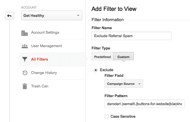
Option #1 – Create a website custom audience: Facebook advertising is all about “audiences” now. You need to specify the type of people you want to show your ads to, and Facebook takes care of the rest.

But there are a few different ways to create an audience.

One way is to create a custom audience, and I’m going to show you 2 variations of that, and why it’s so powerful.

What if you could advertise only to people that know who you are, but aren’t subscribed to you in any way? It’d be great, because you already have some credibility in their eyes.

Here’s what the first custom audience type consists of:

  • You install a tracking pixel on your website (just some HTML code)
  • If someone loads a page with your tracking code on it, they are added to your custom audience
  • You can create specific ads for these visitors

Fair warning, this is most effective if you have a decent volume of website traffic. If you’re only getting 50 people a day, you might find that you can’t get too many impressions with your ads.

If so, try a different method that I’ll show you soon.

If you do have decent traffic, here’s how you get your tracking pixel.

First, go to “ads manager” while logged in to your Facebook account. Click on “Tools” and then “Audiences” along the top toolbar:

image20

Next, click the first button to “create a custom audience”:

image25

That’ll trigger a pop-up with a few different options.

For this first variation, pick “website traffic”:

image13

Once you agree to the terms, you’ll get a new screen with a javascript code.

image17

You install it just like you install Google Analytics on your site. Copy and paste itsomewhere in your header:

image31

If you don’t want to track visitors to certain pages of your website, just don’t put the code on those pages.

Option #1(b) – Create a custom audience based on email subscribers: When you clicked that first blue button, there was one other really useful type of custom audience you can build.

This option allows you to upload the email addresses of your subscribers and customers. Facebook matches these to users so that you can advertise to those subscribers and customers.

There’s also one other amazing benefit of doing this that I’ll show you in option #2.

For now, select “customer list”.

image22

You have a few different options to import your data, pick whichever one you’d like:

image18

In most cases, it’ll be easiest just to upload a .csv or .txt file (the first option).

For example, in Aweber, if you go to your list of subscribers, you can click the “export CSV” button at the bottom to generate a file with all your subscribers data:

image06

Option #2 – Find tons of people that match your best customers: This is probably the most impressive feature of Facebook advertising.

It requires you to create a custom audience first, using either of the variations I already showed you.

Those are powerful targeting tools. But there’s one problem: They’re limited.

You only have so many people visit your website or on your email list. This can limit how far your Facebook ads can reach.

That’s where this option comes in, which allows you to create a “lookalike” audience.

Essentially, Facebook analyzes the custom audience you already made. Their demographics, the pages they like, and the content they post (among other things).

Then, Facebook looks at its billions of other users, and finds other people who share similar traits to your original audience.

This can expand your potential audience by thousands of times what it currently is. And it’s not just any audience, it’s a potential audience that matches the type of people who are already your customers and subscribers.

I hope you see how powerful this really is.

To set it up, go back to the first “audiences” page that you selected from the top menu.

Now, click the second blue button to “create a lookalike” audience.

It’s very simple from here.

In the “source” field, just put your cursor in the text box, and then pick your custom audience from the drop down menu that appears.

You also have the option to specify any countries that you prefer your audience live in.

image15

That’s really it.

Click the “create audience” button and you’ll now have a new audience in your account that you can target with your ads.

Option #3 – Learn to target by interests, but do it well (The standard option):Those first 2 options are great for creating highly targeted audiences that typically convert really well.

However, they do depend on having a decent sized audience already.

Understandably, you may not have a big enough audience yet.

Until you do, you’ll have to go with the old fashioned option, targeting by interests.

When you create an ad, there are a few different areas that allow you to pick options that narrow down Facebook users (that fit into it).

It starts with demographic options, which consists of hard data like age, gender, location, etc.

image00

The better you know your target audience, the better you’ll be able to fill out the demographics that you want to target.

Next up are the interests, which are the most important part.

image08

When you click on the field, you’ll get a large list of interests to choose from, or you can search for a specific term:

image30

These interests come from pages that users like, or at least interacted with.

It’s not perfect, but it can produce a fairly targeted audience.

The alternative is to continue down to the connections section. Choose “advanced combinations” from the dropdown menu:

image19

This lets you be a bit more specific, by entering the pages of your competitors. Your audience will consist of people who have liked those competing pages.

If you have to use this option, try to get as specific as possible. You shouldn’t have a huge audience at the end, or you’ve likely gone too broad and will have poor conversion rates.

Step 4: How much should you spend on Facebook ads?

As I’ve mentioned, Facebook advertising is highly competitive.

Not only that, it takes some time and practice to figure out the best way to convert Facebook users into subscribers or customers.

While Facebook advertising is relatively cheap, you still don’t want to be throwing money away on a campaign that isn’t going to deliver a positive return on investment (ROI).

Determining your bids: When you create an audience, you have a few different bidding options at your disposal:

  • Cost per click (CPC)
  • Cost per mille (CPM: Cost per 1,000 impressions)
  • Optimized CPM

In general, it’s best to go with CPC. When you bid per impression, you never know how where your ad will show up.

Regardless of which option you choose, you’ll be able to set your maximum bid per click or 1,000 impressions.

image24

What you can also do, is have Facebook optimize your ad campaign for a specific event. For example, you can optimize for clicks on a link back to your website:

image01

You do need to be a little wary of this type of optimization.

If you optimize for clicks, Facebook is going to show your ad to users who click on things the most. These are usually the lowest quality traffic (but not always), because they’re always ready to click on the next thing.

Regardless of which options you choose, you’ll get a suggested bid range.

If you’re brand new to advertising, start on the low end of this range. The lower you bid, the fewer impressions you’ll get, but it still may be enough for you.

You can always increase bids later.

There isn’t a definitive best bidding option, you should try them all out.

How much will you spend? Don’t start out spending hundreds of dollars per day. Wait until you have a profitable campaign before you scale up to that.

When you’re first creating a campaign, you’re asked to specify your maximum daily budget.

image05

For most people, spending $5 per day is enough to start.

This will allow you to collect a good sample over a few weeks to determine if the ad campaign is worth trying to improve.

If a particular ad is performing horribly after a few thousand impressions – scrap it.

Step 5: The most profitable advertisers have one thing in common…

Most beginner advertisers have the wrong impression of successful advertisers.

They believe that experienced advertisers put together a few new ads for a campaign, and are able to achieve profitability on most of them.

The reality is that most ads are losers, at least initially.

The goal of your first ads shouldn’t be to get an amazing ROI, because it’s very unlikely that you will.

Your goal should be to get a slightly profitable or even a break-even result. I’ll tell you why this is a good thing in a minute.

But first, there’s one key thing that all good advertisers know…

They know if a campaign is profitable or not: Never start an advertising campaign without a specific purpose.

You may want to drive traffic to your website.

You may want to get more likes on your Facebook page.

It doesn’t matter: pick a goal that you think is important.

But before you get started, you need to know the value of that goal.

If you’re trying to convert that traffic into email subscribers, you need to have a very good idea of what a subscriber is worth.

The same thing goes for a Facebook like; how much is one worth to you?

If you don’t know this, you’ll never know if your advertising has a positive ROI or not. So estimate this value as accurately as possible.

You want to be able to go into your Facebook reporting, see the “cost per action” (click or like), and instantly know if you’re profitable or not.

image09

The difference between many losing and profitable campaigns: I just told you that a break-even first ad is a good thing.

Any guesses why?

The reason is that you can almost always improve your conversion rates by split testing those ads.

It’s pretty easy to turn most break-even ad campaigns into solid profiting ones.

For example, one split test was able to lower the cost per conversion from $2.6 to $1.04. That’s a 60% decrease in cost per conversion.

image14

That’s a pretty rare improvement, but smaller improvements can be made to most ads.

Split testing is very simple and doesn’t take a lot of time.

You simply duplicate an ad that you’ve created, keeping everything the same, and then you change only one part of it.

After you let it run for a statistically valid amount of time, you’ll be able to tell if that one change had any effect on your results.

What can you test?

  • The image
  • The description
  • The heading
  • Your targeting options

Typically, the image will have the biggest effect, based on the reasons we went over earlier.

I’ve included a whole chapter on how to run your first split test in my guide to conversion optimization.

Conclusion

Facebook represents one of the largest user bases on the entire Internet.

For 99%+ of niches, you can find a large portion of your target audience on Facebook.

Advertising is the most effective way to quickly get your message to this audience.

However, like any advertising, you can lose money if you’re not smart about it. But if you follow the 5 steps that I’ve laid out in this post, you’ll make fewer mistakes than most others would.

Content Marketing Examples from 10 Top Brands

By Ashley Taylor Anderson and first appearing on ceros.com.

Brand Content Marketing Examples

When you think about your favorite brands, what comes to mind? An image? A person? A story?

The most powerful brands ingrain themselves into our lives with great content. Historically, this content has been limited to ads and commercials. Today, brands are creating content for a variety of channels, showing different facets of their personality with articles, videos, music, and microsites.

There are hundreds of brands with excellent content marketing programs. However, that’s not very helpful if you’re trying to find specific brands to rely on for inspiration and guidance.

In this article, we’ll take a look at content marketing examples from 10 top brands and dive into what’s so great about each one. By the time we’re done, you should have some ideas and inspiration to take away and use in your own content marketing program.

EXAMPLE 1: COCA-COLA JOURNEY

Coca-Cola Journey

Brand: Coca-Cola

Website: http://www.coca-colacompany.com/

What I Love

Coca-Cola has long been a frontrunner when it comes to brand content creation. In recent years, they’re really upped the ante with their online magazine, Coca-Cola Journey.

A few specific things that I love about their content marketing approach:

  • The site curates articles, videos, music, and historical tidbits all in one place.
  • Content is organized in a way that allows the viewer to choose what they’re interested in and how they want to consume that content (by topic, type, or brand).
  • Popular and recommended content is curated and easy to find.
  • User generated content is pulled in via feeds, making the site a two-way conversation between the brand and its fans.

EXAMPLE 2: THE RED BULLETIN

The Red Bulletin

Brand: Red Bull

Website: http://www.redbulletin.com/us/us

What I Love

Red Bull is the Taylor Swift of brand content marketing. Marketers totally envy their enormous success. Even if you’re not the target audience for Red Bull’s content, you can certainly appreciate their approach.

While the brand has gotten more buzz from their in-person events / stunts, their digital content is equally thrilling. For example, on their microsite The Red Bulletin, they show content marketing savvy in a variety ways.

  • Their site looks sexy, reinforcing their modern brand ethos.
  • Their editorial content covers a nice mix of topics: culture, lifestyle, sports, and tips.
  • Every piece of content relates back to topics their readers actually care about.
  • They make great use of imagery, quotes, and videos in articles, pulling them out in a magazine-like way without being beholden to print conventions.

EXAMPLE 3: DESTINATION KORS

Destination Kors

Brand: Michael Kors

Website: http://destinationkors.michaelkors.com/

What I Love

Michael Kors is a luxury brand, but one with a more approachable, friendly persona than some of the more historic design houses. One tactic that contributes to this persona is Destination Kors, the brand’s content hub.

A few things that really work for this editorial microsite include:

  • Content of varying depths, including snaps of celebs wearing Michael Kors clothes in the wild, brief interviews with models, and full articles on trends.
  • Expert opinions, predictions, and recommendations from Michael Kors himself.
  • Integration of social causes via Kors Cares initiatives.
  • Consistent ties back to products without making the content overly salesy.

EXAMPLE 4: WORLD IN MOTION

GE World in Motion

Brand: GE

Website: http://www.ge.com/world-motion

What I Love

GE is working on amazing projects across the globe. Their World in Motion site does a great job of sharing those stories in an interactive and innovative way.

Some of the many things I love about World in Motion:

  • Their interactive map navigation system is really clever.
  • You can explore content by region, and they geotarget your region when you enter the site to show you the stories in your area first.
  • They let you drill down into stories by topic and by format, providing a highly flexible way to explore content.

EXAMPLE 5: FLYER FEED

Virgin America Flyer Feed

Brand: Virgin America

Website: http://blog.virginamerica.com/blog/

What I Love

Virgin America is one of my favorite brands. I mean, come on: Their original in-flight safety video was pretty much the best thing ever. (Nuns with laptops! Matador and his disgruntled bull friend! So cute.)

It’s no wonder, then, that I’m crushing hard on their Flyer Feed blog. This content marketing hub really carries out the Virgin American ethos with:

  • A great use of dry and snarky humor.
  • Fun polls that get the audience engaged with the brand.
  • Expert advice (ask Joe G.) that further reinforces how close the brand is to its audience.
  • News and deals that aren’t totally lame.
  • Their own hashtag library that real live people actually use on social.

EXAMPLE 6: THINK WITH GOOGLE

Think with Google

Brand: Google

Website: https://www.thinkwithgoogle.com/

What We Love

Tech giant that it is, Google has been somewhat slow to get into the content marketing game. Their Think with Google site has been around for awhile, but it’s only in the last year or two that it’s really become a content powerhouse worthy of its discerning marketer audience.

Some of the reasons this site is so great:

  • They share tons of original research and case studies in a digestible, interesting format.
  • They have a great website design (finally) that makes you want to stick around and read more.
  • They integrate interactive tools like calculators and maps into their content to bring it to life.

EXAMPLE 7: OH MY DISNEY

Oh My Disney

Brand: Disney

Website: http://blogs.disney.com/oh-my-disney/

What I Love

Given that they’ve built an empire around content, one would expect Disney to be good at content marketing. And that they are. They have a number of blogs for different age ranges and interests, but my favorite is Oh My Disney, which is targeted to millennial readers.

What’s great about this site is:

  • It’s got a playful and witty tone.
  • It channels BuzzFeed with fun, digestible content that appeals to the emotions.
  • It has a nice mix of content about Disney movies and parks.
  • They’re able to monetize with ads that aren’t overly pushy (and that tie in with Disney characters).

EXAMPLE 8: WHOLE STORY

Whole Story

Brand: Whole Foods

Website: http://www.wholefoodsmarket.com/blog/whole-story

What I Love

Before Whole Foods came along, I never would have guessed that a U.S. grocery chain would develop a killer content marketing program. But then, before Whole Foods, there wasn’t a grocery chain with a real brand identity (except for maybe Trader Joe’s).

The franchise’s blog, Whole Story, is completely aligned with the interests and needs of its core audience. A few of the things I appreciate about Whole Story are:

  • Their strong content recommendation engine (at the end of each post and also in the sidebar via OneSpot).
  • They have practical posts such as recipes and DIY instructions, but also include other types of content such as updates on environmental legislation their shoppers would care about.
  • They leverage contests and giveaways.
  • They have a clear benefit statement for their email newsletter signup.

EXAMPLE 9: FOUR SEASONS MAGAZINE

Four Seasons Magazine

Brand: Four Seasons Hotels

Website: http://magazine.fourseasons.com/

What I Love

The hospitality industry has always provided a lot of content for its patrons—think of those in-room guides on every desk and racks of brochures in the hotel lobby. Today, top brands have expanded their content marketing into the digital realm as well.

Four Seasons Hotels produces one of my favorite hospitality content marketing resources: Four Seasons Magazine. Here are a few reasons this magazine is so great:

  • The site’s graphics and design appeal to an upscale audience.
  • It features a nice mix of practical tips and hotel highlights.
  • The content is tailored to different interests so that foodies, adventurers, spa-goers, and business travelers can all find something relevant for them.

EXAMPLE 10: THE VANISHING GAME

The Vanishing Game - Land Rover

Brand: Land Rover

Website: https://thevanishinggame.wellstoried.com

What I Love

Land Rover has struggled with its image in recent years. As a brand, it’s not very sexy. Consumers didn’t really connect with it they way they connect with other automotive labels.

That’s why The Vanishing Game was pure content marketing genius. In this immersive interactive microsite, they employ true multimedia storytelling to convey a thrilling tale that also (secondarily) highlights their vehicles.

Some bits of genius I really enjoyed:

  • The effective use of hypertext to isolate background photos and videos.
  • The menu of customization options on the right side that allow the viewer to experience the story exactly the way they want to.
  • The use of background video in combination with text content.

THE BOTTOM LINE

The brands with the strongest content marketing programs are the ones who have a strong identity, great stories to tell, and a savvy understanding of how technology can help deliver those stories in a unique and compelling way.

Designers Should Design, Coders Should Code

By Marcin Treder, Ryan Thomas Riddle, and Jerry Cao and first appearing on FastCompany.com

HERE’S WHY YOU NEED SOMEONE WHO UNDERSTANDS CODE BUT DOESN’T NECESSARILY LIVE IN IT.

It’s an old argument: should designers code? And it gets a lot of people up in arms, some in favor while others not so much. We’ve even chimed in before.

Yet everyone wants the Unicorn. You know the type: designers who can craft stunning visuals, plan winning user experiences, handle clients with panache, and code semantic HTML5 with bleeding-edge CSS3. But are those really necessary? Maybe what’s needed is someone who understands code but doesn’t necessarily live in it.

Quality can suffer when designers stretch themselves too thin. Keeping up with everything is impractical. Designers can spend many hours learning the nuance of code when they should focus on solving problems.

Today we live in a world of specialists. Front-end devs speak in HTML and semantics. Others delve into CSS and Sass. Visual designers study interactions. Server technicians make it run. Client liaisons build relationships. Everyone can focus on what they love. Too bad it’s not enough.

A new dynamic must take the place of unicorns: communication among specialists. Specialists need to know what others are capable of, even if they don’t understand the precise techniques. The key is to never operate alone.

CODE’S CAPABILITIES AREN’T SO FOREIGN

If you’re a designer, then chances are you’re already empathetic with coders’ mindsets. That’s one of the top qualities we seek at UXPin when evaluating design talent.

You pay attention to detail. So do coders. You’re passionate about your work. So are they. You understand interaction design, and they understand how to make it work. What coders need to know is why, you want, say, links across the top of a widescreen design to jump down the side on tablets. So learning to speak each other’s language is critical to communicating ideas.

Luckily visual design and code are more related than many people realize. It’s not hard to make the jump from graphical tools to concepts in CSS. Did you know that InDesign’s paragraph styles are analogous to CSS selectors? Or that Sketch 3 can export browser-friendly XML? Just as Photoshop has layer effects, code has its hidden gems and secret techniques. But if you’re not aware that, say, CSS can give an element multiple shadows, then you’ll never discover ways to take advantage of them.

A generalist would spend time deciding how to use shadows, then spend more time implementing it. And that could come at a switch cost—having to constantly switch mindsets. Not to mention that it takes a lot of time to get really good at it. A specialist designer, on the other hand, would decide how to use it, work with a developer on implementing it, then jump on the next task.

This ties back to communication: designers who are aware of certain techniques don’t need to know their exact inner workings. Smart designers respect the fact that coders are more in tune with feasibility. Their job is to stay current with bleeding-edge techniques and browser limits. When it comes to possibilities, coders are a designer’s best friend. And the bridge between them is empathy.

EMPATHY MEANS TAKING OTHER POINTS OF VIEW

Designers need to relate to both their clients and the rest of their team to understand not just what they’re saying, but what they really mean. And that calls for a little humility.

Design, which lies at the crossroads of art and science, is an extremely powerful ego booster. When designers work, they feel clever and creative at the same time. Because a product and its design are inseparable (which we elaborated in Interaction Design Best Practices), designers feel almost a sense of parental responsibility. That devotion also creates a dangerous trap.

Unicorns can be proud beasts. And that’s a problem. Ego emotionally isolates them from coworkers, preventing them from making greater products than they can alone.

That’s not to say designers shouldn’t feel passion for their work. But designs do not serve designers. They solve problems for other people. Understanding the root of the problems, not just critical feedback about color and layout, will help designers build products that will keep end users coming back.

As a collaborative design app, we can’t stress this enough: empathy smooths over team communication, which leads to better products in the end.

MEETING IN THE MIDDLE REQUIRES A LITTLE INSIGHT

Designers and coders live in overlapping worlds.

While designers serve human needs—solving users’ problems and addressing their goals—coders tackle onerous technical and server issues. The two come together when designers hand off their vision to coders. Yet implementing the plan requires a different set of skills, which is where things tend to fall apart.

Coders need more guidance than “just make it work” for even relatively simple techniques like, say, parallax scrolling—to say nothing of AJAX requests and DOM manipulation. Flat PSDs only scratch the surface of interaction design. Database-driven mockups require designers to drop their trade and pick up something in which they’re less proficient. Compounding the problem is that interfaces are increasingly complex: animation and interaction are now the norm in web design.

Maybe that’s why job descriptions that require proficiency in everything chase away many candidates. It’s not unusual for a job posting* to ask for:

  • 5+ years of web design experience
  • Responsive webpage layout design
  • Fundamentals of design imaging, animation and multimedia design
  • Content management
  • Experience with WordPress, Joomla and/or Drupal
  • Determining technical requirements of the page and the hosting environment
  • Ability to work together with technical people defining the content of the pages, giving recommendation on the best presentation style, etc.
  • Ability to work together and adopt the design elements created by graphical designer(s)

*From a real job post at dice.com.

Yet designers don’t need to know how the DOM works, or how to troubleshoot the idiosyncrasies of asynchronous exchanges. They need to know that such things are possible, and how to communicate the problem and solution to the people who do know such things. The only way to tackle this is with open collaboration in which both sides have an inkling of what’s going on without having to specialize in each other’s fields.

GOING FORWARD TOGETHER

As a designer, the more you specialize, the more you benefit the team.

But solving problems isn’t enough. Understanding what’s possible in HTML, CSS, JS will help designers create practical web designs—products that developers can actually build, and that clients can maintain. Products that work well in the wild. Products that users use.

Comprehension begets understanding. Learning the ideas behind code is an important part of understanding something else—rather, someone else (the hard-core coders). When you articulate yourself with the right terminology, you can properly communicate your design ideas to people who specialize in HTML, CSS and JavaScript.

Then you can focus on what you love: design.

How To Stop Referrer Spam

By Jon Henshaw, Co-founder and President of Raven Internet Marketing Tools. Originally posted on Raven Tools Blog.

Attack of the Referrer Spam

Referrer spam is becoming a problem. If you’re not familiar with referrer spam, it’s traffic from bots that impersonate a referral link. The pseudo traffic is designed to make their domain show up in your site analytics so that you’ll visit the site.

Why is Referrer Spam a Problem? Aside from junking up your site analytics with useless data, it’s a big waste of time. We’ve heard from many of our customers here at Raven just how frustrating it is to explain what “semalt” is to their clients and why it doesn’t matter.

While it’s possible to create a filter in Google Analytics to filter out referrer spammers like semalt, all it does is mask the problem. Also, as Himanshu Sharma has written about, it may create data sampling problems. So instead of filtering out bad data after the fact, I’m going to show you how to block it at the source.

Referrer Spam

How To Stop Referrer Spam

The key to stopping referrer spam is to block it before it has a chance to register on your site as a referrer. The simplest way to do this is to add the following code to your .htaccess file.

## SITE REFERRER BANNING
RewriteCond %{HTTP_REFERER} semalt.com [NC,OR]
RewriteCond %{HTTP_REFERER} buttons-for-website.com [NC,OR]
RewriteCond %{HTTP_REFERER} seoanalyses.com [NC]
RewriteRule .* - [F]

Deflecting

Another technique you can use is a Deflector, which redirects the traffic back to where it came from. Avi Wilensky, CEO ofPromediacorp prefers this method to just blocking them. He creates a text file named deflector.map that looks like this.

#
## deflector.map
##
##referer --> redirect target
http://semalt.com http://semalt.com
http://seoanalyses.com http://seoanalysis.com
http://buttons-for-website.com http://buttons-for-website.com

Then he puts the following code in his .htaccess file.

RewriteMap deflector txt:/path/to/deflector.map
RewriteCond %{HTTP_REFERER} !=""
RewriteCond ${deflector:%{HTTP_REFERER}} =-
RewriteRule ^ %{HTTP_REFERER} [R,L]

I haven’t tried this yet, but I plan to. If you’ve had any experience with deflecting, please tell us about it in the comments below.

Blacklists

Shelli Walsh, of ShellShock UK, recommends using a blacklist of referrers and Regex coupled with commonly used spammy keywords. An example of this is available from Perishable Press.

The only problem with currently known referrer spam blacklists — at least the ones I found — is that they don’t seem to be kept up-to-date.

WordPress Plugin

For those who don’t have access to their .htaccess file or don’t feel like they have the experience to properly edit it, there’s a WordPress plugin for it. For many webmasters, semalt is the worst offender. That’s why Peadig created the Semalt Blocker for WordPress.

The Semalt Blocker plugin is currently limited to only blocking semalt, but the plugin creator, Alex Moss, has assured me that they’re working on a new version that will allow users to add more sites to block as needed.

Efficient Management of .htaccess

Another annoyance of having to block referrer spam is updating the .htaccess file for all of your sites. Fortunately, there’s a trick that Brian LaFrance of AuthorityLabs shared with me. He uses an umbrella .htaccess file for all of his sites. He does that by storing an .htaccess file in the directory that contains all of his site directories. The server will read that .htaccess file prior to each site’s individual .htaccess file, so the bots are stopped for all sites nested under that directory.

Personally, I like to use unique .htaccess files for each of my sites, but I still like for things to be as efficient as possible. My solution has been to create symbolic links to all of my .htaccess files in one folder. That way I have access to all of them, and then I can quickly open, paste and save…open, paste and save…

Here’s a spambot list that’s frequently updated.

Update – March 23, 2015

After writing and publishing this post, two new pieces of information were presented to me.

First, Rishi Lakhani would like credit for coming up with the Semalt Blocker plugin by Peadig.

He also wrote an excellent post on referrer spam over at Refugeeks that you should check out.

Second, Georgi Georgiev pointed me to his post that analyzes all of the options for blocking referrer spam. He concluded that the best overall solution is to create a custom filter in Google Analytics.

You can create a filter for your sites in Google Analytics by navigating to the Admin and then clicking on All Filters. Click on the New Filter button and then create a Custom Exclude for Campaign Source. Enter the domains you want to exclude using Regex. The format should be domain.\ followed by a pipe (|) for each additional domain.

darodar\.|semalt\.|buttons-for-website|blackhatworth|ilovevitaly|prodvigator|cenokos\.|ranksonic\.|adcash\.|simple-share-buttons\.|social-buttons\.

It should look similar to this screenshot:

Google Analytics Filter

What about you? How do you block botnets?

Update – April 20, 2015

Matthieu Napoli left a helpful link to a Referrer Spam Blacklist hosted by Piwik on GitHub. Many thanks to Matthieu for sharing that.

Update – June 16, 2015

Tom Capper at Distilled discovered another way to filter out referrer spam in Google Analytics. He suggests using a screen resolution exclusion.

Update – August 24, 2015

For a full list of the Spam links our team currently blocks, visit my Resource Page.

Distance from Perfect

By Ian Lurie and first published on Moz.com

In spite of all the advice, the strategic discussions and the conference talks, we Internet marketers are still algorithmic thinkers. That’s obvious when you think of SEO.

Even when we talk about content, we’re algorithmic thinkers. Ask yourself: How many times has a client asked you, “How much content do we need?” How often do you still hear “How unique does this page need to be?”

That’s 100% algorithmic thinking: Produce a certain amount of content, move up a certain number of spaces.

But you and I know it’s complete bullshit.

I’m not suggesting you ignore the algorithm. You should definitely chase it. Understanding a little bit about what goes on in Google’s pointy little head helps. But it’s not enough.

A tale of SEO woe that makes you go “whoa”

I have this friend.

He ranked #10 for “flibbergibbet.” He wanted to rank #1.

He compared his site to the #1 site and realized the #1 site had five hundred blog posts.

“That site has five hundred blog posts,” he said, “I must have more.”

So he hired a few writers and cranked out five thousand blogs posts that melted Microsoft Word’s grammar check. He didn’t move up in the rankings. I’m shocked.

“That guy’s spamming,” he decided, “I’ll just report him to Google and hope for the best.”

What happened? Why didn’t adding five thousand blog posts work?

It’s pretty obvious: My, uh, friend added nothing but crap content to a site that was already outranked. Bulk is no longer a ranking tactic. Google’s very aware of that tactic. Lots of smart engineers have put time into updates like Panda to compensate.

He started like this:a few posts, no rankings

And ended up like this:more posts, no rankings

Alright, yeah, I was Mr. Flood The Site With Content, way back in 2003. Don’t judge me, whippersnappers.

Reality’s never that obvious. You’re scratching and clawing to move up two spots, you’ve got an overtasked IT team pushing back on changes, and you’ve got a boss who needs to know the implications of every recommendation.

Why fix duplication if rel=canonical can address it? Fixing duplication will take more time and cost more money. It’s easier to paste in one line of code. You and I know it’s better to fix the duplication. But it’s a hard sell.

Why deal with 302 versus 404 response codes and home page redirection? The basic user experience remains the same. Again, we just know that a server should return one home page without any redirects and that it should send a ‘not found’ 404 response if a page is missing. If it’s going to take 3 developer hours to reconfigure the server, though, how do we justify it? There’s no flashing sign reading “Your site has a problem!”

Why change this thing and not that thing?

At the same time, our boss/client sees that the site above theirs has five hundred blog posts and thousands of links from sites selling correspondence MBAs. So they want five thousand blog posts and cheap links as quickly as possible.

Cue crazy music.

SEO lacks clarity

SEO is, in some ways, for the insane. It’s an absurd collection of technical tweaks, content thinking, link building and other little tactics that may or may not work. A novice gets exposed to one piece of crappy information after another, with an occasional bit of useful stuff mixed in. They create sites that repel search engines and piss off users. They get more awful advice. The cycle repeats. Every time it does, best practices get more muddled.

SEO lacks clarity. We can’t easily weigh the value of one change or tactic over another. But we can look at our changes and tactics in context. When we examine the potential of several changes or tactics before we flip the switch, we get a closer balance between algorithm-thinking and actual strategy.

Distance from perfect brings clarity to tactics and strategy

At some point you have to turn that knowledge into practice. You have to take action based on recommendations, your knowledge of SEO, and business considerations.

That’s hard when we can’t even agree on subdomains vs. subfolders.

I know subfolders work better. Sorry, couldn’t resist. Let the flaming comments commence.

To get clarity, take a deep breath and ask yourself:

“All other things being equal, will this change, tactic, or strategy move my site closer to perfect than my competitors?”

Breaking it down:

“Change, tactic, or strategy”

A change takes an existing component or policy and makes it something else. Replatforming is a massive change. Adding a new page is a smaller one. Adding ALT attributes to your images is another example. Changing the way your shopping cart works is yet another.

A tactic is a specific, executable practice. In SEO, that might be fixing broken links, optimizing ALT attributes, optimizing title tags or producing a specific piece of content.

A strategy is a broader decision that’ll cause change or drive tactics. A long-term content policy is the easiest example. Shifting away from asynchronous content and moving to server-generated content is another example.

“Perfect”

No one knows exactly what Google considers “perfect,” and “perfect” can’t really exist, but you can bet a perfect web page/site would have all of the following:

  1. Completely visible content that’s perfectly relevant to the audience and query
  2. A flawless user experience
  3. Instant load time
  4. Zero duplicate content
  5. Every page easily indexed and classified
  6. No mistakes, broken links, redirects or anything else generally yucky
  7. Zero reported problems or suggestions in each search engines’ webmaster tools, sorry, “Search Consoles”
  8. Complete authority through immaculate, organically-generated links

These 8 categories (and any of the other bazillion that probably exist) give you a way to break down “perfect” and help you focus on what’s really going to move you forward. These different areas may involve different facets of your organization.

Your IT team can work on load time and creating an error-free front- and back-end. Link building requires the time and effort of content and outreach teams.

Tactics for relevant, visible content and current best practices in UX are going to be more involved, requiring research and real study of your audience.

What you need and what resources you have are going to impact which tactics are most realistic for you.

But there’s a basic rule: If a website would make Googlebot swoon and present zero obstacles to users, it’s close to perfect.

“All other things being equal”

Assume every competing website is optimized exactly as well as yours.

Now ask: Will this [tactic, change or strategy] move you closer to perfect?

That’s the “all other things being equal” rule. And it’s an incredibly powerful rubric for evaluating potential changes before you act. Pretend you’re in a tie with your competitors. Will this one thing be the tiebreaker? Will it put you ahead? Or will it cause you to fall behind?

“Closer to perfect than my competitors”

Perfect is great, but unattainable. What you really need is to be just a little perfect-er.

Chasing perfect can be dangerous. Perfect is the enemy of the good (I love that quote. Hated Voltaire. But I love that quote). If you wait for the opportunity/resources to reach perfection, you’ll never do anything. And the only way to reduce distance from perfect is to execute.

Instead of aiming for pure perfection, aim for more perfect than your competitors. Beat them feature-by-feature, tactic-by-tactic. Implement strategy that supports long-term superiority.

Don’t slack off. But set priorities and measure your effort. If fixing server response codes will take one hour and fixing duplication will take ten, fix the response codes first. Both move you closer to perfect. Fixing response codes may not move the needle as much, but it’s a lot easier to do. Then move on to fixing duplicates.

Do the 60% that gets you a 90% improvement. Then move on to the next thing and do it again. When you’re done, get to work on that last 40%. Repeat as necessary.

Take advantage of quick wins. That gives you more time to focus on your bigger solutions.

Sites that are “fine” are pretty far from perfect

Google has lots of tweaks, tools and workarounds to help us mitigate sub-optimal sites:

  • Rel=canonical lets us guide Google past duplicate content rather than fix it
  • HTML snapshots let us reveal content that’s delivered using asynchronous content and JavaScript frameworks
  • We can use rel=next and prev to guide search bots through outrageously long pagination tunnels
  • And we can use rel=nofollow to hide spammy links and banners

Easy, right? All of these solutions may reduce distance from perfect (the search engines don’t guarantee it). But they don’t reduce it as much as fixing the problems.Just fine does not equal fixed

The next time you set up rel=canonical, ask yourself:

“All other things being equal, will using rel=canonical to make up for duplication move my site closer to perfect than my competitors?”

Answer: Not if they’re using rel=canonical, too. You’re both using imperfect solutions that force search engines to crawl every page of your site, duplicates included. If you want to pass them on your way to perfect, you need to fix the duplicate content.

When you use Angular.js to deliver regular content pages, ask yourself:

“All other things being equal, will using HTML snapshots instead of actual, visible content move my site closer to perfect than my competitors?”

Answer: No. Just no. Not in your wildest, code-addled dreams. If I’m Google, which site will I prefer? The one that renders for me the same way it renders for users? Or the one that has to deliver two separate versions of every page?

When you spill banner ads all over your site, ask yourself…

You get the idea. Nofollow is better than follow, but banner pollution is still pretty dang far from perfect.

Mitigating SEO issues with search engine-specific tools is “fine.” But it’s far, far from perfect. If search engines are forced to choose, they’ll favor the site that just works.

Not just SEO

By the way, distance from perfect absolutely applies to other channels.

I’m focusing on SEO, but think of other Internet marketing disciplines. I hear stuff like “How fast should my site be?” (Faster than it is right now.) Or “I’ve heard you shouldn’t have any content below the fold.” (Maybe in 2001.) Or “I need background video on my home page!” (Why? Do you have a reason?) Or, my favorite: “What’s a good bounce rate?” (Zero is pretty awesome.)

And Internet marketing venues are working to measure distance from perfect. Pay-per-click marketing has the quality score: A codified financial reward applied for seeking distance from perfect in as many elements as possible of your advertising program.

Social media venues are aggressively building their own forms of graphing, scoring and ranking systems designed to separate the good from the bad.

Really, all marketing includes some measure of distance from perfect. But no channel is more influenced by it than SEO. Instead of arguing one rule at a time, ask yourself and your boss or client: Will this move us closer to perfect?

Hell, you might even please a customer or two.

One last note for all of the SEOs in the crowd. Before you start pointing out edge cases, consider this: We spend our days combing Google for embarrassing rankings issues. Every now and then, we find one, point, and start yelling “SEE! SEE!!!! THE GOOGLES MADE MISTAKES!!!!” Google’s got lots of issues. Screwing up the rankings isn’t one of them.

The Absolute Beginner’s Guide to Google Analytics

By Kristi Hines and first published on Moz.com.

If you don’t know what Google Analytics is, haven’t installed it on your website, or have installed it but never look at your data, then this post is for you. While it’s hard for many to believe, there are still websites that are not using Google Analytics (or any analytics, for that matter) to measure their traffic. In this post, we’re going to look at Google Analytics from the absolute beginner’s point of view. Why you need it, how to get it, how to use it, and workarounds to common problems.

Why every website owner needs Google Analytics

Do you have a blog? Do you have a static website? If the answer is yes, whether they are for personal or business use, then you need Google Analytics. Here are just a few of the many questions about your website that you can answer using Google Analytics.

  • How many people visit my website?
  • Where do my visitors live?
  • Do I need a mobile-friendly website?
  • What websites send traffic to my website?
  • What marketing tactics drive the most traffic to my website?
  • Which pages on my website are the most popular?
  • How many visitors have I converted into leads or customers?
  • Where did my converting visitors come from and go on my website?
  • How can I improve my website’s speed?
  • What blog content do my visitors like the most?

There are many, many additional questions that Google Analytics can answer, but these are the ones that are most important for most website owners. Now let’s look at how you can get Google Analytics on your website.

How to install Google Analytics

First, you need a Google Analytics account. If you have a primary Google account that you use for other services like Gmail, Google Drive, Google Calendar, Google+, or YouTube, then you should set up your Google Analytics using that Google account. Or you will need to create a new one.

This should be a Google account you plan to keep forever and that only you have access to. You can always grant access to your Google Analytics to other people down the road, but you don’t want someone else to have full control over it.

Big tip: don’t let your anyone (your web designer, web developer, web host, SEO person, etc.) create your website’s Google Analytics account under their own Google account so they can “manage” it for you. If you and this person part ways, they will take your Google Analytics data with them, and you will have to start all over.

Set up your account and property

Once you have a Google account, you can go to Google Analytics and click the Sign into Google Analytics button. You will then be greeted with the three steps you must take to set up Google Analytics.

google analytics setup

After you click the Sign Up button, you will fill out information for your website.

setting up a new account in google analytics
Google Analytics offers hierarchies to organize your account. You can have up to 100 Google Analytics accounts under one Google account. You can have up to 50 website properties under one Google Analytics account. You can have up to 25 views under one website property.

Here are a few scenarios.

  • SCENARIO 1: If you have one website, you only need one Google Analytics account with one website property.
  • SCENARIO 2: If you have two websites, such as one for your business and one for your personal use, you might want to create two accounts, naming one “123Business” and one “Personal”. Then you will set up your business website under the 123Business account and your personal website under your Personal account.
  • SCENARIO 3: If you have several businesses, but less than 50, and each of them has one website, you might want to put them all under a Business account. Then have a Personal account for your personal websites.
  • SCENARIO 4: If you have several businesses and each of them has dozens of websites, for a total of more than 50 websites, you might want to put each business under its own account, such as 123Business account, 124Business account, and so on.
    There are no right or wrong ways to set up your Google Analytics account—it’s just a matter of how you want to organize your sites. You can always rename your accounts or properties down the road. Note that you can’t move a property (website) from one Google Analytics account to another—you would have to set up a new property under the new account and lose the historical data you collected from the original property.

For the absolute beginner’s guide, we’re going to assume you have one website and only need one view (the default, all data view. The setup would look something like this.

new account information google analytics
Beneath this, you will have the option to configure where your Google Analytics data can be shared.

configuring shared info for google analytics
Install your tracking code

Once you are finished, you will click the Get Tracking ID button. You will get a popup of the Google Analytics terms and conditions, which you have to agree to. Then you will get your Google Analytics code.

find google analytics tracking code
This must be installed on every page on your website. The installation will depend on what type of website you have. For example, I have a WordPress website on my own domain using the Genesis Framework. This framework has a specific area to add header and footer scripts to my website.

installing google analytics tracking code wordpress genesis
Alternatively, if you have a WordPress on your own domain, you can use the Google Analytics by Yoast plugin to install your code easily no matter what theme or framework you are using.

If you have a website built with HTML files, you will add the tracking code before the tag on each of your pages. You can do this by using a text editor program (such as TextEdit for Mac or Notepad for Windows) and then uploading the file to your web host using an FTP program (such as FileZilla).

adding google analytics tracking code to head tag
If you have a Shopify e-commerce store, you will go to your Online Store settings and paste in your tracking code where specified.

adding google analytics tracking code to shopify account
If you have a blog on Tumblr, you will go to your blog, click the Edit Theme button at the top right of your blog, and then enter just the Google Analytics ID in your settings.

adding google analytics tracking code to tumblr
As you can see, the installation of Google Analytics varies based on the platform you use (content management system, website builder, e-commerce software, etc.), the theme you use, and the plugins you use. You should be able to find easy instructions to install Google Analytics on any website by doing a web search for your platform + how to install Google Analytics.

Set up goals

After you install your tracking code on your website, you will want to configure a small (but very useful) setting in your website’s profile on Google Analytics. This is your Goals setting. You can find it by clicking on the Admin link at the top of your Google Analytics and then clicking on Goals under your website’s View column.

setting up goals in google analytics
Goals will tell Google Analytics when something important has happened on your website. For example, if you have a website where you generate leads through a contact form, you will want to find (or create) a thank you page that visitors end upon once they have submitted their contact information. Or, if you have a website where you sell products, you will want to find (or create) a final thank you or confirmation page for visitors to land upon once they have completed a purchase.

That URL will likely look something like this.

In Google Analytics, you will click on the New Goal button.

adding a new goal to google analytics
You will choose the Custom option (unless one of the other options are more applicable to your website) and click the Next Step button.

setting custom goals in google analytics
You will name your goal something you will remember, select Destination, and then click the Next Step button.

naming a goal in google analytics
You will enter your thank you or confirmation page’s URL after the .com of your website in the Destination field and change the drop-down to “Begins with”.

setting goal details google analytics
You will then toggle the value and enter a specific dollar value for that conversion (if applicable) and click Create Goal to complete the setup.

If you have other similar goals / conversions you would like to track on your website, you can follow these steps again. You can create up to 20 goals on your website. Be sure that the ones you create are highly important to your business. These goals (for most businesses) include lead form submissions, email list sign ups, and purchase completions. Depending on your website and its purpose, your goals may vary.

Note that this is the simplest of all conversion tracking in Google Analytics. You can review the documentation in Google Analytics support to learn more about setting up goal tracking.

Set up site search

Another thing you can set up really quickly that will give you valuable data down the road is Site Search. This is for any website with a search box on it, like the search box at the top of the Moz Blog.

site search moz
First, run a search on your website. Then keep the tab open. You will need the URL momentarily.

site search query parameter
Go to your Google Analytics Admin menu again, and in the View column, click on View Settings.

setting up search query parameter in google analytics
Scroll down until you see Site Settings and toggle it to On.

site search settings in google analytics
Look back at your URL for your search results. Enter the query parameter (usually s or q) and click Save. On Moz, for example, the query parameter is q.

entering the query parameter in google analytics site search
This will allow Google Analytics to track any searches made on your website so you can learn more about what your visitors are looking for on specific pages.

Add additional accounts and properties

If you want to add a new Google Analytics account, you can do so by going to your Admin menu, clicking on the drop-down under the Account column, and clicking the Create New Account link.

add account google analytics
Likewise, if you want to add a new website under your Google Analytics account, you can do so by going to your Admin menu, clicking on the drop-down under the Property column, and clicking the Create New Property link.

create new property google analytics
Then you will continue through all of the above-mentioned steps.

Once you’ve installed Google Analytics on your website(s), set up your goals, and set up site search(es), you should wait about 24 hours for it to start getting data. Then you will be able to start viewing your data.

How to view Google Analytics data

Once you start getting in Google Analytics data, you can start learning about your website traffic. Each time you log in to Google Analytics, you will be taken to your Audience Overview report. Alternatively, if you have more than one website, you will be taken to your list of websites to choose from, and then taken to the Audience Overview report for that website. This is the first of over 50 reports that are available to you in Google Analytics. You can also access these reports by clicking on the Reporting link at the top.

viewing google analytics
Standard report features

Most of the standard reports within Google Analytics will look similar to this. At the top right, you can click on the drop-down arrow next to your website to switch to different websites within all of your Google Analytics accounts. Or you can click the Home link at the top.

google analytics audience overview
In the report at the top right, you can click on the dates to change the date range of the data you are viewing. You can also check the Compare box to compare your data from one date range (such as this month) to a previous date range (such as last month) to view your data.

google analytics date range select
You can hover over a variety of areas on your Google Analytics reports to get more information. For example, in the Audience Overview, hovering over the line on the graph will give you the number of sessions for a particular day. Hovering over the metrics beneath the graph will tell you what each one means.

google analytics hover
Beneath the main metrics, you will see reports that you can switch through to see the top ten languages, countries, cities, browsers, operating systems, services providers, and screen resolutions of your visitors.

screen resolution report google analytics
You can click the full report link on each to see the full reports. Or you can click on any of the top ten links to see more details. For example, clicking on the United States in Countries will take you to the full Location report, focused in on visitors from states within the US.

location report google analytics
In this view, you can hover over each state to see the number of visitors from that state. You can scroll down to the table and hover over each column name to learn more about each metric.

visitors by state google analytics
You can also click on the name of each state to see visitors from cities within the state. Effectively, any time you see a clickable link or a ? next to something, you can click on it or hover over it to learn more. The deeper you dive into your analytics, the more interesting information you will find.

Types of Google Analytics reports

Speaking of reports, here is quick summary of what you will find in each of the standard Google Analytics reporting sections, accessible in the left sidebar.

types of google analytics reports
Everything in (parenthesis) is a specific report or set of reports within the following sections that you can refer to.

Audience reports

These reports tell you everything you want to know about your visitors. In them, you will find detailed reports for your visitors’ age and gender (Demographics), what their general interests are (Interests), where they come from (Geo > Location) and what language they speak (Geo > Language), how often they visit your website (Behavior), and the technology they use to view your website (Technology and Mobile).

Acquisition reports

These reports will tell you everything you want to know about what drove visitors to your website (All Traffic). You will see your traffic broken down by main categories (All Traffic > Channels) and specific sources (All Traffic > Source/Medium).

You can learn everything about traffic from social networks (Social). You can also connect Google Analytics to AdWords to learn more about PPC campaigns and to Google Webmaster Tools / Search Console to learn more about search traffic (Search Engine Optimization)

Behavior reports

These reports will tell you everything you want to know about your content. Particularly, the top pages on your website (Site Content > All Pages), the top entry pages on your website (Site Content > Landing Pages), and the top exit pages on your website (Site Content > Exit Pages).

If you set up Site Search, you will be able to see what terms are searched for (Site Search > Search Terms) and the pages they are searched upon (Site Search > Pages).

You can also learn how fast your website loads (Site Speed) as well as find specific suggestions from Google on how to make your website faster (Site Speed > Speed Suggestions).

Conversions

If you set up Goals within your Google Analytics, you can see how many conversions your website has received (Goals > Overview) and what URLs they happened upon (Goals > Goal URLs). You can also see the path that visitors took to complete the conversion (Goals > Reverse Goal Path).

Speaking of goals and conversions, most of the tables within Google Analytics standard reports will tie specific data to your conversions. For example, you can see the number of conversions made by visitors from California in the Audience > Geo > Location report. You can see the number of conversions made by visitors from Facebook in the Acquisitions > All Traffic > Source/Medium report. You can see the number of conversions made by visitors who landed on specific pages in the Behavior > Site Content > Landing Pages report.

google analytics conversions
If you have multiple goals, you can use the dropdown at the top of that section of data to switch to the goal you want to view or all of your goals if you prefer.

Shortcuts and emails

While you won’t need every report within Google Analytics, you should explore them all to see what they have to offer. When you find some that you want to visit again and again, use the Shortcut link at the top of the report to add them to the Shortcuts in your left sidebar for faster access.

google analytics shortcuts
Or, use the email button to have them emailed to you (or others on your team) on a regular basis.

google analytics emailed reports
If you choose to send emails to someone outside of your organization, be sure to regularly check your emails by going to your Admin menu and clicking on the Scheduled Emails box under the View column to ensure only people working with your company are getting your data.

google analytics admin window
Answers to common questions about Google Analytics

Got a few questions? Here are some of the common ones that come up with Google Analytics.

How do I share my Google Analytics data with someone?

You don’t have to give your Google account information over to someone who needs access to your Google Analytics data. You just need to go to your Admin menu and under the Account, Property (website) or View you want someone to see, click the User Management menu.

adding user to google analytics
From there, you can add the email address of anyone you would like to view your Google Analytics data and choose the permissions you would like them to have.

user permissions google analytics
I don’t like viewing the reports in Google Analytics. Can someone just summarize the data for me?

Yes! Quill Engage is a service that will take your Google Analytics data and summarize it in an easy-to-read report for you. Best of all, it’s free for up to ten profiles (websites).

quill engage summary report google analytics
I have a dozen websites, and I don’t want to check each of their Google Analytics on a daily basis. What do I do?

You have two options in this scenario. You start by going to the Home screen of Google Analytics. There, you will find a listing of all your websites and an overview of the top metrics—sessions, average session duration, bounce rate, and conversion rate.

google analytics home screen
You can also try business dashboard solutions like Cyfe. For $19 a month, you can create unlimited dashboards with unlimited widgets, including a large selection of data from Google Analytics, alongside data from your social media networks, keyword rankings, Moz stats, and more.

cyfe dashboard google analytics
This solution significantly cuts down on the time spent looking at analytics across the board for your entire business.

Google Analytics says that 90%+ of my organic keywords are (not provided). Where can I find that information?

(not provided) is Google’s way of protecting search engine user’s privacy by hiding the keywords they use to discover your website in search results. Tools like Google Webmaster Tools (now Search Console, free), Authority Lab’s Now Provided Reports (paid), and Hittail (paid) can all help you uncover some of those keywords.

search analytics keyword data
They won’t be linked to your conversions or other Google Analytics data, but at least you will have some clue what keywords searchers are using to find your website.

How do I use Custom Reports, Dashboards, and Segments?

If you’re ready to move to the next level in Google Analytics, Custom Reports, Dashboards, and Segments are the way to go.

Custom Reports (under the Customization menu at the top) allow you to create reports that look similar to the standard Google Analytics reports with the metrics you want to view.

custom report google analytics
Dashboards allow you to view your Google Analytics data in a dashboard format. You can access them at the top of the left sidebar.

google analytics dashboard
Segments allow you to view all of your Google Analytics data based on a specific dimension, such as all of your Google Analytics data based on visitors from the United States. You can also use them to compare up to four segments of data, such as United States versus United Kingdom traffic, search versus social traffic, mobile versus desktop traffic, and more. You can access Segments in each of your reports.

audience comparison google analytics
The nice part about these is that you don’t have to create them from scratch. You can start by using pre-defined Custom Reports, Dashboards, and Segments from the Google Solutions Gallery.
google solutions gallery
There, you will find lots of Custom Reports, Dashboards, Segments, and other solutions that you can import into your Google Analytics and edit to fit your needs. Edit Custom Reports with the Edit button at the top.

edit custom reports google analytics

Edit Dashboards using the Add Widget or Customize Dashboard buttons at the top.


Edit Segments by clicking the Action button inside the Segments selector box and choosing Edit.
edit segments google analytics

Or, when you have applied Segments to your reports, use the drop-down arrow at the top right to find the Edit option.

As you get used to editing Custom Reports, Dashboards, and Segments, you will get more familiar with the way each works so you can create new ones on your own.

In conclusion

I hope you’ve enjoyed this beginner’s introduction to Google Analytics for beginners. If you’re a beginner and have a burning questions, please ask in the comments. I’ll be happy to help!

About kristihines — Kristi Hines is a freelance writer, professional blogger, and social media enthusiast. Connect with her onTwitter and Google+.

Please take a look at the original article on Moz and read the comments at the bottom. Others have posted some really great information here!

The Generational Content Gap: How Different Generations Consume Content Online

By Irfan Ahmad and first published on Social Media Today.

How to optimize your content strategy for your target market - #Infographic

As online audiences continue to grow and diversify, it’s essential for content marketers to understand what resonates with their customers. One of the most important factors is how different age groups will react to specific types of content. BuzzStream and Fractl surveyed over 1200 people from three generations – Millennials (people who born in between 1981-1997), Generation X (born 1965-1980), and Baby Boomers (born 1946–1964) – to learn how content preferences differ among these groups.

Key takeaways:

  1. Late Evening, between 08 PM to 11:59 PM, is when most people like to consume content. Try to post content during this time to reach the largest audience.
  2. Don’t forget to optimize for mobile. More than a quarter of Millennials use mobile as their primary device for viewing content.
  3. Don’t be too wordly; all generations agree that 300 words is the sweet spot for article length.
  4. Generation X uses Twitter as a primary content sharing platform 70.4 percent more than Baby Boomers. Baby Boomers use Google+ as a primary content sharing platform 92 percent more than Millennials.
  5. Millennials prefer sharing memes 54.7 percent more than Baby Boomers. Generation X likes sharing slide-shares 49.6 percent more than Millennials. Baby Boomers prefer sharing images and videos the most.

Take a look at the infographic below for more insights.

Google Reports That 56% of Your Ads Aren’t Seen

by Mike Dickman

I just heard this startling figure at a marketing conference this week and could hardly believe it. So, I had to do some research and share what I had found.

It appears that Google let the cat out of the bag last December (2014) when disclosing factors that impact ad viewability. The actual number is 56.1%, not that the extra tenth of one percent makes a difference!

And, it’s not like Google tried to hide this stat. They actually published an Infographic about it! (http://bit.ly/1HmIqOi) In this Inforgraph, Google pointed to factors such as: State of publisher viewability, Page position, Ad size, Above/below the fold and Viewability across industries.

In 2012, ComScore released data that 31% of display ads weren’t seen. This data was based on a study of 1.7 billion impressions from 18 campaigns be a dozen brands. In 2013, ComScore released another study finding that 54% of display ads aren’t seen. Why the big difference? One of the points that stood out was the difference in viewability between premium publishers and ad exchanges and networks.

comscore ad viewability by premium vs networks and exchanges

During the marketing conference other factors were discussed, such as: bots that make it appear as if there were human eyes looking at the ads when it was really nothing more than some fabricated tool to increase impressions; unethical groups hiring offshore labor to simply click ads all day long.

So, what is being done? Google, actually, is suggesting that viewable impressions should be the new standard. Their viewability measurement tool, Active View, is integrated into both the Google Display Network and DoubleClick. Advertisers can monitor viewability rates and buy ads on a viewable impression basis rather than served impressions.